Loading content...
Table of Contents
Back to Projects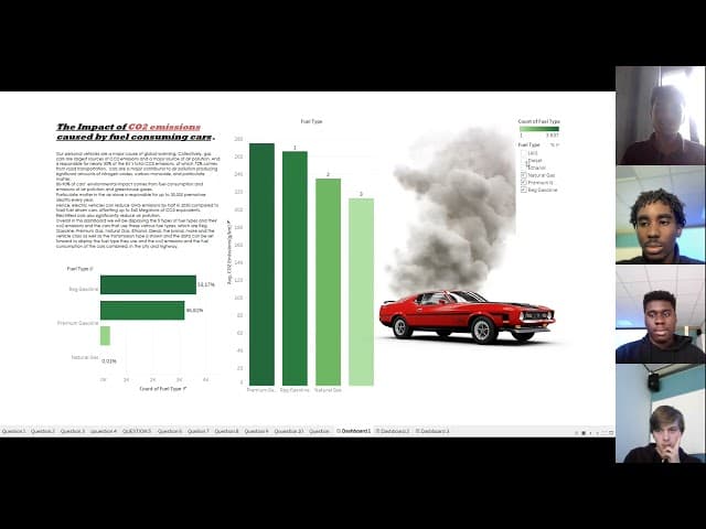
Tableau Data Visualization Project
Analyzed and visualized a dataset comparing electric and fuel-powered cars using Tableau.
Tableau
About Project
My team of four used Tableau to visualize and analyze a dataset on electric and fuel-powered cars. The project was guided by requirements from our lecturer and employees from Ordina. Our goal was to tell a story with the data and find connections between the two types of vehicles. This project was my first practical experience using Tableau to turn data into clear and engaging visuals.
Responsibility
My main role was to make the dashboard interactive and easy to use. I built features like filters, tooltips, and drill-downs so people could explore the data in more detail. I also created two key charts: one showing the average price per car and another comparing a car's price to its acceleration. Finally, I presented our findings on the relationship between car prices and how fast they charge.
Conclusion
This project was a great introduction to Tableau and data visualization. I learned how to use data not just to create charts, but to build a compelling story. The biggest takeaway for me was understanding how to present complex information simply, so that the audience isn't overwhelmed. This experience taught me the value of using data to communicate insights effectively.